
A logo can look sharp on a business card and still fail when it is reduced to a left-chest embroidery. Fine lines close up, tiny lettering fills in, and color transitions that work on screen become bulky thread. So, can embroidery reproduce small logos? Yes, when the artwork is prepared for thread rather than simply shrunk from a digital file.
For uniforms, event apparel, caps, and corporate gifts, this distinction matters. Embroidery gives a logo a premium, durable finish, but it has physical limits. A successful result depends on the logo’s smallest details, the intended placement, the garment fabric, and the quality of the digitizing process. The best production plan protects your identity while making sure every piece remains readable in real-world use.
Can Embroidery Reproduce Small Logos on Apparel?
Embroidery can reproduce a small logo very effectively when the design has clear shapes, sufficient spacing, and lettering sized for stitches. It is especially strong for bold icons, simple monograms, clean wordmarks, and logos with solid color blocks. A polished embroidered logo can make polos, work shirts, jackets, caps, tote bags, and bags feel more established than a flat print.
The limitation is that thread has thickness. Unlike ink, it cannot create a hairline stroke, a tiny gap, or a subtle gradient with unlimited precision. Every element needs enough room for the needle, thread, backing, and stitch path to work together. When a logo is reduced too far, thread can overlap, letters can merge, and the design can lose its intended proportions.
That does not mean a detailed logo is unusable. It means the logo may need an embroidery-ready version. A reliable supplier will review the artwork before production and recommend practical adjustments rather than approving a design that will not stitch cleanly.
What Makes a Small Embroidered Logo Work
The most important factor is not the overall logo width. It is the smallest feature inside the logo. A 3-inch-wide logo can still be difficult if it includes very small type below a large symbol. Conversely, a compact 2-inch logo may stitch beautifully if it uses bold lettering and simple geometry.
For small left-chest logos, lettering generally needs to be at least 0.25 inch tall, or about 6 mm, to remain reasonably legible. For the clearest result, especially with narrow fonts or complex letters, 0.3 inch or larger is safer. Very small text may need to be removed, enlarged, or replaced with a simplified line of copy. This is common for company taglines, registration marks, website addresses, and department names.
Line weight also matters. Thin strokes may become broken or disappear, while gaps between shapes can close as stitches pull against the fabric. Clean outlines, open counters inside letters such as “a,” “e,” and “o,” and generous spacing between design elements all improve clarity.
Color count has an effect as well. Multiple thread colors are possible, but a compact logo with many small color sections can become visually crowded. Simplifying close shades or combining minor details into one color often produces a stronger branded result from a normal viewing distance.
Digitizing Is the Difference Between Artwork and Embroidery
A JPG, PNG, PDF, or vector file is not automatically an embroidery file. Before production, the artwork must be digitized. Digitizing is the process of mapping the logo into stitch types, stitch directions, density, sequence, underlay, and trims that tell an embroidery machine how to build the design.
Good digitizing accounts for the way fabric moves. It also accounts for push and pull, which is the natural shifting that occurs as thread is stitched into a garment. Without compensation, circles can look slightly oval, narrow letters can close, and borders can become uneven.
For a small logo, the digitizer may use satin stitches for letters and outlines, fill stitches for larger areas, and carefully placed underlay to stabilize the design. The stitch direction may change between sections to create definition and reduce distortion. These technical choices are not decorative extras. They are what make the final logo look balanced instead of dense, stiff, or unclear.
At Green Cotton, artwork review is part of protecting specification accuracy. If a design needs a minor adjustment to deliver a clean embroidered result, resolving it before bulk production saves time, avoids inconsistent branding, and keeps the finished garments aligned with your approval.
Fabric and Placement Change the Result
The same logo does not stitch the same way on every product. Smooth, stable fabrics such as cotton pique polos, twill caps, workwear, and structured bags are generally excellent embroidery surfaces. The stitches sit evenly and retain clear edges.
Stretchy performance fabrics, thin T-shirts, fleece, ribbed materials, and heavily textured surfaces require more care. A dense design on lightweight knit fabric can cause puckering, while a detailed logo on fleece can sink into the pile. Stabilizers, backing selection, stitch-density adjustments, and placement methods help manage these issues, but they cannot make an overly intricate small logo behave like a large one.
Placement also determines how much space is available. Left-chest embroidery is popular for corporate uniforms because it is professional and recognizable, but it usually requires a compact design. Caps often need further simplification because the curved front panel and limited embroidery field affect detail. Sleeve logos, collar marks, and pocket-area branding should be treated as small-format applications from the beginning.
If your logo contains a detailed emblem plus a long company name, consider using the emblem alone for a cap or sleeve while reserving the full logo for a larger chest, back, or bag placement. This is not a compromise in brand standards. It is a deliberate system that keeps your branding consistent across different products.
When to Simplify a Logo for Embroidery
An embroidery adaptation is worth considering when the original artwork includes tiny text, photographic shading, very thin outlines, intricate borders, gradients, or several elements packed tightly together. The goal is not to redesign your identity. It is to preserve the elements people recognize first: your icon, name, signature colors, and overall visual character.
A practical embroidery version may remove a tagline, thicken key lines, enlarge spaces between letters, and convert a gradient into solid thread colors. In some cases, an outline is removed so the central shape stays clear. These changes are usually subtle at normal viewing distance, but they dramatically improve production quality.
Organizations with multiple branded applications benefit from maintaining two approved logo files: a full logo for print, digital use, and larger decoration areas, plus a simplified embroidery logo for small garments and accessories. Your HR team, marketing department, event coordinator, or procurement lead can then order confidently without reconsidering the artwork for every product category.
Choosing Embroidery Versus Other Decoration Methods
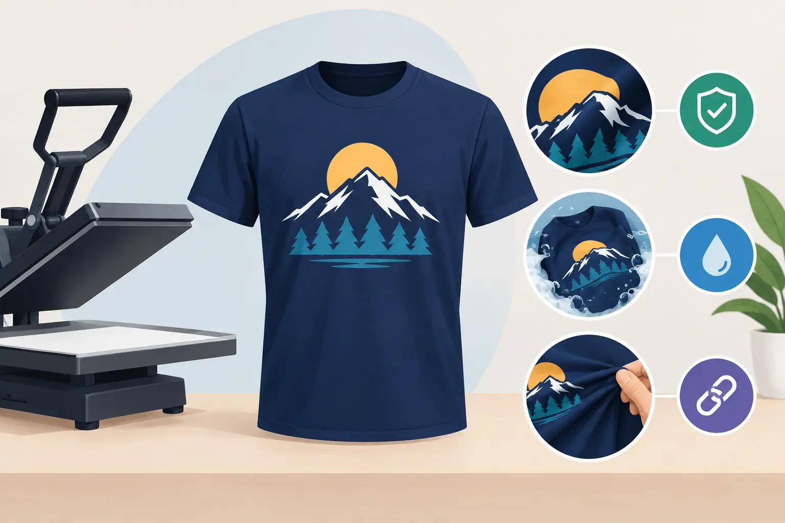
Embroidery is not always the best method for a small, highly detailed logo. It is ideal when you want dimension, durability, and a premium uniform appearance. It performs well on polos, button-down shirts, jackets, caps, and sturdy bags, particularly for logos that use clear, bold components.
If the design depends on fine text, intricate illustration, gradients, or very small elements, direct-to-garment printing, heat transfer, or screen printing may reproduce it more accurately. Sublimation can be particularly useful for all-over sports jerseys and designs with detailed color transitions, although it applies to suitable polyester garments rather than every fabric type.
The right method depends on the garment, logo size, order quantity, viewing distance, and desired finish. A workwear program may use embroidery for chest branding and a print method for a detailed campaign graphic on the back. Combining decoration methods can give your organization both a professional uniform standard and full creative freedom where detail matters most.
How to Prepare Your Logo Before Ordering
Start with the best artwork available, preferably an editable vector file such as AI, EPS, or PDF. High-resolution artwork helps, but clean vector art gives the production team the most control when evaluating small details. State where the logo will be placed, its approximate size, the garment type, and the quantity required.
It also helps to share whether the logo must include every element. If the tagline is mandatory for a formal corporate polo but optional for caps, that information allows the production team to recommend suitable versions early. Request a digital embroidery preview or sew-out approval for new designs, especially before a large uniform rollout or event order.
Do not judge the design only at full-screen size. View it at the approximate size it will appear on the garment. If the words or lines are difficult to see at that scale on screen, embroidery will likely need simplification.
A small embroidered logo should not try to tell your whole brand story in one square inch. Give the design enough room to be recognized, and let experienced production planning translate it into thread with the clarity your team, customers, and event guests will notice.