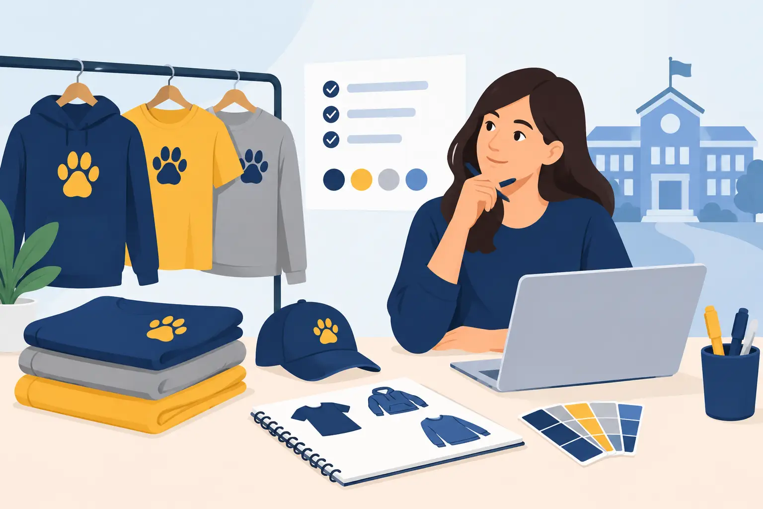

A staff uniform has to survive more than a first impression. It is worn through busy shifts, washed repeatedly, packed for roadshows, and seen by customers at close range. That is where screen printing earns its place. For organizations ordering branded apparel in volume, it delivers bold color, dependable repeatability, and a finish designed for regular use.
The method is especially effective when the same logo, message, or event design needs to appear consistently across dozens, hundreds, or thousands of garments. But a good result is never just about putting ink on a shirt. Fabric choice, artwork setup, ink selection, print placement, and production planning all affect the final product.
Why screen printing works for bulk apparel orders
Screen printing applies ink to a garment through a mesh screen. Each color in a design is prepared as a separate screen, then printed in sequence and cured with heat. The process takes care and setup time, but once production begins, it is highly efficient for repeat designs at scale.
For procurement teams and event organizers, the value is practical: the print is vivid, consistent from one garment to the next, and cost-effective as order quantities increase. A one-color chest logo on 300 cotton tees, for example, is often a strong fit because the setup is shared across the full run. The same principle applies to staff uniforms, campaign merchandise, school shirts, volunteer apparel, and promotional giveaways.
Print durability is another major advantage. When the right ink system and curing process are used, a screen-printed design can stand up well to repeated washing. This matters for workwear and teamwear, where faded branding or cracked prints can make an otherwise good uniform look prematurely worn.
That said, screen printing is not automatically the best choice for every job. Artwork with many colors, fine photographic gradients, or low quantities may be better suited to direct-to-garment printing, heat transfer, or another decoration method. The right decision depends on the garment, artwork, quantity, intended use, and deadline.
Screen printing starts with clear specifications
The most efficient production runs begin before artwork reaches the press. A clear brief prevents assumptions and helps the manufacturer recommend the right garment and decoration approach. For a business order, this means defining more than the logo file.
Start with the garment’s job. A promotional T-shirt for a one-day event can prioritize budget and visual impact. A restaurant uniform needs comfort, color consistency, and reliable laundering. A construction or logistics crew may need heavier workwear, high-visibility details, or a placement that remains visible around safety gear.
Next, confirm who will wear it and how. Unisex sizing may simplify an event order, while a corporate uniform program may require separate cuts, extended size ranges, and a structured reorder process. If garments will be distributed across several branches, consistent specifications become even more important. The same navy polo should remain the same navy polo from one order to the next.
A useful apparel brief should state the garment type, fabric composition, color, size breakdown, quantity, print locations, artwork dimensions, and required delivery date. If there are brand guidelines, include approved logo versions and color references early. This reduces revision cycles and protects brand consistency.
Artwork quality affects print quality
A clean screen print begins with production-ready artwork. Vector files are generally preferred for logos and graphic designs because they can scale without losing sharp edges. Artwork should also identify the intended spot colors rather than relying only on how colors appear on a monitor.
Small details deserve an honest review. Fine lines, tiny text, distressed effects, and closely spaced elements can look excellent in a digital mockup but may require adjustment for fabric printing. A capable production partner will flag risks before the garments are printed, not after.
Consider viewing the design at its actual print size. A slogan that reads clearly on a laptop screen may become difficult to read when printed at three inches wide on a left chest. In many cases, simplifying the artwork improves both legibility and long-term visual impact.
Choosing garments and inks for the intended use
The relationship between fabric and ink is central to a successful order. Cotton is a popular choice for screen printing because it accepts ink well and offers a familiar, comfortable feel. Cotton-rich blends can also work well, though the production team should account for potential dye migration on certain dark polyester fabrics.
Polyester performance apparel brings its own considerations. It is lightweight, moisture-managing, and useful for sports or active teams, but it may need specialized low-bleed inks to prevent dye from affecting light-colored prints during curing. This is not a detail to leave to chance when a white logo is being printed on a deep red or navy jersey.
Ink selection also shapes the finished feel. Plastisol ink is widely used for its opacity, color strength, and durability. It is a dependable option for bold logos, especially on dark garments where a strong, opaque print is needed. Water-based inks can create a softer hand feel, particularly on lighter cotton garments, because the ink absorbs more into the fibers. The best option depends on the design, garment color, desired feel, and performance expectations.
For organizations focused on premium uniforms, ask for a sample or pre-production approval when timing allows. It gives stakeholders a chance to check the garment color, logo scale, placement, and texture in person. A sample is particularly valuable when several departments need to approve a new uniform rollout.
Print placement should support the brand, not compete with it
The left chest remains a standard choice for company polos, button-downs, jackets, and workwear because it is professional and recognizable without overwhelming the garment. A large center-chest print works well for event shirts, retail merchandise, and campaign graphics. Back prints are useful when a team needs high visibility from a distance, such as event crews, delivery staff, or volunteers.
There is no single correct placement. A restaurant team may benefit from a refined left-chest logo, while a fitness challenge may need a large front graphic and sponsor logos on the back. The important point is consistency. When multiple garments are part of one program – T-shirts, polos, caps, tote bags, and outerwear – the branding should feel connected even when the decoration method changes.
Avoid crowding every available surface. A front logo, back message, sleeve mark, and individual name can be effective when each element serves a purpose. If every print competes for attention, the apparel can feel more like a noticeboard than a professional brand asset.
Timing and quantity shape the production plan
Screen printing rewards early planning. Because each design requires screen preparation, color matching, setup, printing, curing, and quality checks, production schedules should be built around the actual needs of the order rather than an assumed turnaround time.
Quantities influence both unit cost and method selection. Higher volumes typically make screen printing more economical, especially for designs with fewer colors. However, adding colors adds screens, setup, and production complexity. A four-color illustration may be worth the investment for a flagship campaign, while a one- or two-color logo can be the smarter choice for a practical uniform program.
Deadlines should include time for artwork approval, garment sourcing, sampling if required, production, packing, and delivery. Last-minute changes to shirt color, print size, or size breakdown can affect more than the artwork. They may require a revised production schedule or change what inventory is available.
For recurring orders, create a documented specification sheet after the first run. It should record garment style, fabric, approved color, print locations, dimensions, ink colors, and packing requirements. This turns future reorders into a controlled process instead of a fresh start each time.
Quality control is visible in the details
A screen-printed order should be checked for more than whether the logo appears on the garment. Alignment, color consistency, ink coverage, curing, placement, and garment condition all matter. On a large run, small inconsistencies can become highly visible once uniforms are distributed across a team.
At Green Cotton, production planning is built around specification accuracy because branded apparel represents the organization wearing it. Whether the order is for a corporate rollout, school activity, product launch, or staff appreciation event, the aim is the same: apparel that looks intentional, performs reliably, and arrives ready for use.
Care instructions should also be shared with wearers when appropriate. Turning printed garments inside out before washing, using cold or warm water, and avoiding high heat can help preserve both the fabric and print over time. For uniforms, these small habits extend the life of the investment.
The best branded apparel does not need to explain itself. It looks right on the first day, still represents the organization after repeated wear, and gives every person in the group a clear, consistent identity. Plan the print with the same care you give the brand, and the garment will keep doing its job long after the event ends.