A navy polo that arrives slightly too purple, a logo red that prints too orange, or a tote bag that clashes with the event backdrop can make an otherwise polished program feel unplanned. This brand color matching guide helps procurement teams, marketers, HR leaders, and event organizers turn brand standards into clear production specifications for custom apparel and merchandise.
Color matching is not simply choosing the closest shade from a screen. It is the process of defining which color standard matters, where it will appear, what material it will be applied to, and which decoration method can reproduce it consistently. Getting those decisions right before bulk production protects your brand identity, reduces approval delays, and gives every team member a more professional look.
Start With a Color Standard, Not a Screenshot
A logo downloaded from a website or copied into a presentation is not a production-ready color reference. Screens use RGB light, and every monitor displays that light differently. A shade that looks bright royal blue on one laptop may appear deeper or more violet on another.
For physical branded products, Pantone references are usually the strongest starting point. A Pantone color gives your supplier a common target for screen-printing inks, custom-dyed fabrics, coated merchandise, and other production applications. If your organization has a brand guideline, provide the approved Pantone, CMYK, RGB, and HEX values together, along with the original vector logo file.
Each code has a different role. RGB and HEX guide digital displays. CMYK is designed for process printing on paper. Pantone is often the most useful reference for spot-color production. They can be related, but they are not interchangeable. Asking a printer to match an RGB value exactly on a cotton shirt sets the wrong expectation from the beginning.
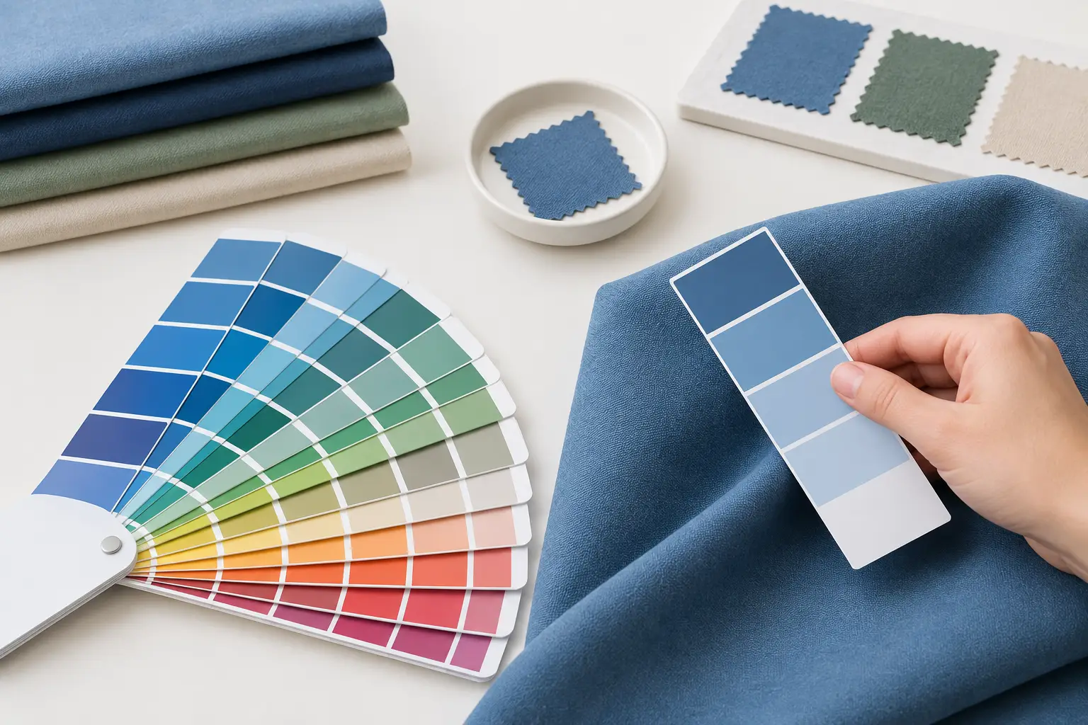
When no formal brand guide exists, select a physical swatch as the master reference. Name the color clearly in your order documentation and approve it before the rest of the collection moves forward. A simple label such as “Blue” is too open to interpretation. “Match approved navy fabric swatch dated May 2026” creates a usable production instruction.
Brand Color Matching Guide: Match the Method to the Product
The same brand color can look different on a T-shirt, an embroidered cap, a polyester jersey, and a canvas tote. That is normal. Different materials absorb, reflect, and texture color in different ways. The goal is controlled consistency, not an unrealistic promise that every surface will look identical under every light source.
Screen Printing for Solid, Repeatable Color
Screen printing is a reliable choice for bold logos, large graphics, and uniform programs that need strong color coverage at volume. Spot-color inks can be mixed to target a Pantone reference closely, especially on garments with a stable base fabric.
The garment color still matters. White ink on black fabric requires an underbase, while yellow ink on a dark polo may need a white foundation beneath it to stay bright. That underbase can slightly affect the final shade and feel of the print. For large orders, request a pre-production sample or strike-off on the actual garment color, not only an ink drawdown on paper.
Embroidery for Texture and Long-Term Wear
Embroidery uses thread, not ink. Thread charts contain a wide range of shades, but not every Pantone color has a perfect thread equivalent. Fine details may also blend visually when stitched, particularly in small logos.
Choose embroidery when durability, dimension, and a premium uniform finish are priorities. Be prepared to approve the nearest thread match rather than demand an exact Pantone reproduction. For a corporate shirt or workwear program, the overall balance of logo size, thread density, and fabric contrast often matters more than a barely perceptible color difference.
Sublimation for All-Over Teamwear
Sublimation is especially effective for custom polyester jerseys, sportswear, and designs that need gradients, patterns, or full-coverage color. The dye becomes part of the fabric, so there is no added print layer and no limitation on the number of colors in the artwork.
However, sublimation works best on white or very light polyester. The base fabric affects every printed shade because the process does not lay opaque ink over the garment. If your brand requires an exact deep color across a jersey, discuss fabric selection and sample approval early. A custom-dyed fabric may be the better route for the main garment color, with sublimation used for graphics and names.
Heat Transfer and Direct-to-Garment for Detailed Artwork
Heat transfer and direct-to-garment printing can handle detailed, multi-color designs and smaller quantities efficiently. They are useful for campaign shirts, short-run event merchandise, or artwork with photographic elements.
These methods offer flexibility, but color results depend on artwork preparation, garment composition, pretreatment, and the print system. A complex image should be evaluated as a whole rather than judged against one isolated color code. If brand-critical solid colors are central to the design, screen printing or embroidery may provide more control.
Consider Fabric, Lighting, and Garment Color
Fabric is part of the color decision. Cotton tends to absorb ink differently from polyester. A smooth performance fabric reflects light differently from a textured pique polo. Heather garments introduce multiple fiber colors, which can mute printed artwork. Even two white garments from different fabric constructions may make the same logo appear slightly different.
Lighting creates another source of variation. Cool office lighting, warm indoor lighting, and daylight can each change the perceived warmth of a color. Evaluate samples under the conditions where the product will be used when possible. For example, event crew uniforms should be checked in venue lighting, while outdoor teamwear should be reviewed in daylight.
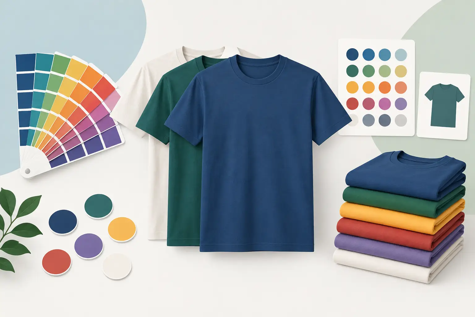
For a coordinated collection, choose one anchor item and build outward. You may use a custom-dyed navy polo as the primary reference, then select cap fabric, tote material, and gift packaging that sit comfortably beside it. Exact matching across every substrate may add cost and lead time. Coordinated matching can deliver a stronger result when materials vary significantly.
Build a Clear Approval Process Before Bulk Production
Color issues often begin with unclear approvals, not poor printing. A dependable production process identifies the decision-maker, the reference standard, and the sample type before manufacturing begins.
Start by submitting your logo in a vector format such as AI, EPS, PDF, or SVG whenever available. Vector artwork keeps edges clean at different sizes and allows production teams to separate spot colors accurately. Include your color codes and note which elements are non-negotiable. Your primary logo blue may require a close Pantone match, while a secondary background tone may allow more flexibility.
Next, ask for the right proof. A digital mockup is useful for confirming placement, sizing, and overall layout, but it cannot confirm true physical color. For high-visibility orders, request a physical fabric swatch, thread card comparison, printed strike-off, or pre-production sample. This is particularly worthwhile for employee uniforms, national campaigns, sponsor merchandise, and repeat orders.
Keep the approved sample and final specifications on file. Document garment style, fabric composition, garment color, Pantone references, print method, print placement, logo dimensions, thread codes, and finishing details. On future orders, that record becomes the benchmark. It also helps maintain consistency when you add new products, locations, or departments.
Avoid Common Color-Matching Mistakes
The fastest way to create inconsistency is to approve colors from a digital mockup alone. Treat a mockup as a design approval, not a final color approval. Physical samples provide the information that screens cannot: opacity, texture, garment interaction, and real-world perception.
Another frequent issue is using a single color value for every application. A brand may need separate specifications for coated print, uncoated paper, textile ink, embroidery thread, and digital use. That does not weaken the brand. It gives each production method a practical target while preserving the intended visual identity.
Finally, do not wait until production is scheduled to decide whether a close match is acceptable. If your timeline is fixed for a conference, school event, or staff rollout, sample approval needs to be part of the schedule. Early decisions give your supplier room to recommend the right method and deliver to specification.
A well-matched uniform or promotional collection tells people your organization pays attention before anyone reads the logo. Bring your brand references, product goals, and deadline into the conversation early. Green Cotton can help translate those details into apparel and merchandise that look intentional, perform well, and arrive ready for your team to represent the brand with confidence.