
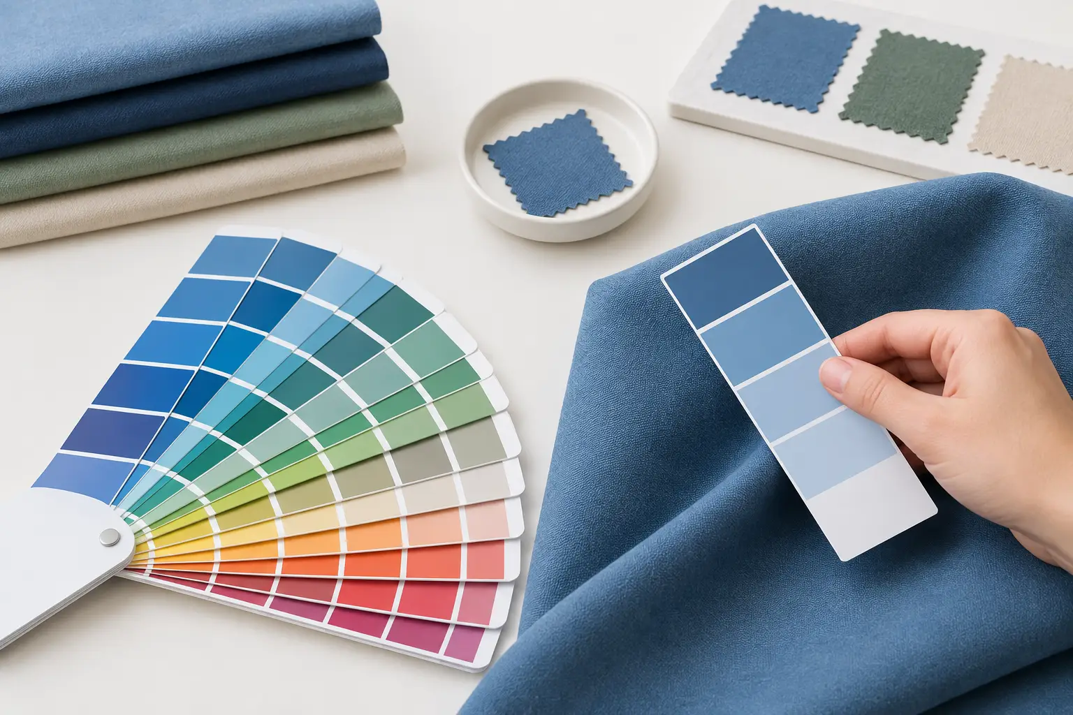
A navy polo that looks right on a screen can arrive looking too purple under office lighting. A bright event T-shirt can lose its impact when the printed logo is slightly off from the brand guide. When you need to match Pantone colors on fabric, the goal is not simply choosing a number. It is building a clear production standard that accounts for material, decoration method, lighting, and approval before bulk manufacturing begins.
For uniforms, teamwear, campaign merchandise, and corporate gifts, color consistency carries real weight. It affects brand recognition, how professional a team appears, and whether products ordered months apart still belong to the same organization. Getting it right requires the right reference and a production partner that treats your brand specifications as production requirements, not loose suggestions.
Why Pantone Color Matching on Fabric Is Different
Pantone is a standardized color language, but fabric is not a flat sheet of coated paper. Fibers absorb dyes differently, knitted and woven surfaces reflect light differently, and textures can make the same shade appear lighter or darker. A smooth polyester performance jersey and a heavyweight cotton pique polo may both be specified in the same Pantone color, yet they will not necessarily look identical side by side.
The color system itself also matters. Pantone guides for print inks are designed for paper and packaging, while Pantone Fashion, Home + Interiors references are intended for textiles and soft goods. If your project involves custom-dyed fabric, a textile-focused reference is generally the more useful starting point. If the color is part of a screen-printed logo, embroidery thread, or heat-transfer graphic, the artwork Pantone value still provides the production target, but it must be translated for that particular decoration process.
A Pantone code is therefore a direction, not an automatic guarantee of a perfect visual match across every substrate. Good color management sets expectations early and creates an approval path that protects your organization from costly surprises.
Start With the Right Color Reference
The strongest color match begins with a physical standard. Screens vary in calibration, brightness, and color settings, so a digital mockup should be used to confirm placement and design, not as the final authority on color. Even a well-managed monitor cannot show exactly how a dyed fabric will appear in daylight, fluorescent lighting, or warm indoor light.
Provide the Pantone reference used in your official brand guidelines, along with any physical sample you have when the color is critical. A previously approved garment, cap, tote bag, or printed item can be helpful as a secondary reference. Be clear about which one takes priority if there is a difference between an older sample and the current Pantone specification.
For a new uniform program, define the intended fabric and garment category before finalizing color. This avoids a common issue: approving a shade on a cotton swatch, then expecting the same visual result on moisture-wicking polyester. The supplier should know whether the color will be used on T-shirts, polos, jackets, sublimation jerseys, bags, or workwear, because each product has its own practical limitations.
Specify the Fabric, Not Just the Shade
Fiber content has a direct effect on color. Cotton is commonly dyed with reactive dyes, while polyester typically uses disperse dyes. Blended fabrics require processes that balance both fiber types. These technical differences influence saturation, brightness, wash performance, and the available color range.
Fabric construction also changes perception. A dense, smooth fabric often shows color more cleanly than a textured pique knit. Heather fabrics intentionally blend multiple fiber colors, which gives a softer appearance but makes exact solid-color matching less realistic. Optical brighteners in white or light fabrics can also shift how adjacent colors appear.
If a strict brand color is non-negotiable, choose fabric quality and construction first, then develop the custom dye match specifically for that material. This is more dependable than selecting a ready-stock fabric and hoping it aligns with a Pantone reference.
Choose the Matching Method for the Product
There are several ways to bring a Pantone color into a custom apparel project. The right route depends on whether the color belongs to the garment itself, a printed design, or an embroidered detail.
For custom-dyed garments, the factory develops a lab dip or fabric swatch based on the selected Pantone reference. This is the preferred approach for large runs of polos, T-shirts, uniforms, and corporate apparel where the body color is central to the brand identity. It takes more planning than selecting an in-stock color, but it gives you more control over the finished result.
For screen printing, ink is mixed to target the required Pantone shade. This works well for solid logos and large graphic areas. The final appearance depends on ink type, print coverage, garment color, and fabric texture. A bright yellow logo on a black shirt may require an underbase, for example, and that additional layer can affect how the final yellow reads.
Sublimation is particularly effective for polyester sportswear and all-over designs. Because the dye becomes part of the polyester fibers, it can produce strong, durable color. However, it is not a universal solution. Sublimation is best suited to high-polyester light-colored garments and cannot create a true white print on dark fabric.
Embroidery uses available thread colors rather than custom-mixed dye formulas. A close Pantone match is often achievable, but very specific colors may need to be approximated with the nearest thread shade. For small logos, that trade-off is usually acceptable. For a large embroidered brand mark or a color-sensitive identity, request a thread chart and a sewn sample before approving production.
Build Color Approval Into Your Timeline
The most reliable way to avoid a mismatch is to approve a physical sample before the full order is made. This is especially valuable for custom-dyed fabric, large event orders, new brand launches, and repeat uniforms that must match existing garments.
A practical color approval process includes these steps:
- Submit the Pantone reference, artwork file, garment style, fabric composition, and intended decoration method.
- Review a lab dip, fabric swatch, strike-off, or pre-production sample made using the actual production materials.
- Assess the sample under neutral daylight as well as the lighting where the garments will be worn, such as retail, office, stadium, or event lighting.
- Confirm approval in writing, including any acceptable tolerance for variation.
- Keep the approved sample and specification on file for repeat orders.
Color should be reviewed before sizing packs, accessory colors, labels, and bulk cutting are finalized. A change after fabric has been dyed or artwork has been set up can affect cost and delivery timing. Early approval gives your supplier room to correct the shade without putting your launch date at risk.
Understand Tolerance and Dye Lot Variation
Even with approved standards, fabric production can involve small variations between dye lots. This is normal in textile manufacturing. Factors such as fiber source, water quality, machine load, and batch conditions can create a slight shift in shade. The objective is controlled consistency within an agreed tolerance, not an unrealistic promise that every batch will be visually identical at a microscopic level.
For one order, garments should generally be produced from the same dye lot wherever possible. This is particularly important for staff uniforms, sports teams, and retail-facing teams standing together. If the order includes multiple garment styles, ask whether each fabric will be developed to the same visual target and whether any natural variation should be expected between products.
Repeat orders deserve additional planning. If your organization reorders uniforms regularly, retain the original Pantone code, approved swatch, fabric details, artwork version, and decoration notes. This creates a usable color history. It also prevents a future buyer from relying on an old photo or an unverified description such as “company blue.”
Avoid the Most Common Color-Matching Mistakes
The biggest mistake is approving colors from a computer screen alone. Another is using a Pantone reference without identifying which Pantone book or material it came from. A third is assuming one color formula will look identical on cotton, polyester, embroidery thread, and printed vinyl.
Timing can create problems too. Custom-dyed fabric and physical sampling need lead time. If an event deadline is fixed, share it at the start so the production plan can balance color development, sample approval, manufacturing, quality checks, and delivery. Choosing a close in-stock fabric color may be the sensible decision for urgent orders, while custom dyeing is usually the better choice for long-term brand programs.
At Green Cotton, color matching is treated as part of the full production specification. The more clearly the fabric, Pantone reference, decoration method, and approval standard are defined, the more confidently a project can move from concept to bulk delivery.
Your brand color should work as hard as the people wearing it. Give it a physical reference, approve it on the actual material, and keep that approved standard for the next order. That small discipline turns a color request into a consistent brand asset.